Week 7 Photo Recreation: Daido Moriyama

Chosen Photograph: ‘Farewell Photography’; photo 1 of 6; 2006

Screen Shot 2016-03-30 at 8.21.34 PM

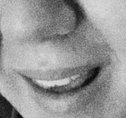
  1. The Composition of the Image:This photograph has a grainy texture and feels as if pointillism is used to create the image. It is from a very close up point of view; the photographer is very intimate with the subject. The shapes are not well defined, but distinguishable. The lines are not clear, however the teeth are very bold. The image is in focus, however it is from very close up so there is much excluded. There is also no color because it is in black and white.
  2. The Use of Light:There is a light source that creates a shadow on the left side of the photograph. The light is used to manipulate the shadow so that there are contrasts between the shapes.
  3. What is the mood of the photograph?The mood of this photograph is happy, however its chosen to be in black and white. There is much joy in the smile seen. It is effortless and seems carefree. Something has made this person happy.
  4. What is the photograph of? [concrete subject]There is a smile, bright and straight teeth and a blurry nose. This photograph was taken from very close up so not much can be seen of the rest of the face. There is a lot  that Moriyama chose to exclude from the photograph.
  5. What is the photograph about? [abstract subject]A person’s soul can be captured in their smile. The things that make one smile help define the person they are and how they choose to interact within the world. Moriyama excludes the rest of the occurrence that made this person smile because he wants to focus on the fact that the subject even has a reason to. There is immense beauty found in the soul of a genuine smile. This smile is not the biggest and could almost be posed, but there is sincerity to it. This photo is declaring that sometimes it doesn’t matter what made one smile, but that there is a reason to.

Photographic Recreation

adsf

The photograph I chose was actually very difficult to recreate. The grainy texture and brightness of the photograph actually did not lend itself to that difficulty. The angle, framing, and ability to capture the similar smile proved an arduous process. I do not have the same face structure as the woman pictured in his photograph and it was hard to capture the subject matter well.

Inspired Photograph

eyes

I chose to take a photograph of my eyes. I chose this location because for me, it is a deeper representation of someone than their smiles. A smile can lie, but the eyes cannot. The eyes are truest route to a person’s soul. However, I was having a great time playing around with the Black and White and grainy texture that Moriyama uses in his smile portrait. It is a washed out black and white, which I have not seen used much before. I wanted to keep that technique in my inspiration. I also thought that his use of this technique was brilliant against the skin, so I kept a location of the body. I do not know if i had changed locations, if it would still be as effective.

Progress Report 1: Week 7 Reflection

In Week 7, I presented my idea and some photos I had already taken for my final project. I had a rough idea of what I wanted to achieve and how I would do so. I knew that in my time in London, that part of my experience that has interacted with me the most is the architecture and uniqueness that diversifies while uniting this city. Everywhere I go, each place is defined by how the roads twist and turn and the way the building interact with the people. They help define the many cultures melting in London. London wears its history and culture in its building. I know I do not like to photograph people because I am not very good at it.

After presenting my ideas, it was clear that my idea was the one I wanted to stick with. I like to use bright colors in my photography, but that was proving to be difficult becuase there is not always guaranteed sunlight in London weather. What I am planning to do, is to go out an take as many photographs as I can from the different areas in London of their buildings, despite the lighting. I will achieve fluidity through framing and point of views. I want the personalities to be represented truthfully and sometimes a bright day does not do that. These photographs will be bold and expressive.

Photographer’s Gallery: Saul Leiter


TITLE OF EXHIBITION: Saul Leiter

NAME OF PHOTOGRAPHER(S) ON SHOW: Saul Leiter

  • What is a common thread running through the exhibition?
    • Saul Leiter is an impressionistic photographer who uses his flaneuristic abilities to capture mood and mystery in his photography. There is a lot of use of color in this exhibit because during his time, color photography was not as common. This meant that capturing it had to be unique. There is fluidity to all of the photographs because its seems as if everything bleeds together. There are also a lot of reflections and shadows used to create depth and exploit the different textures that happen in the world naturally. There is also ideas of postmodernism and the question of identity in the exhibit. Most photographs were taken on the street and of New York.
  • What defines the photographer’s style? What do the images have in common, in terms of both subject matter and technique/style?
    • Leiter used bold colors, exploited textures and tried to question identity. He used lines and framing to highlight the subjects within the photo. Due to the number of his photos being taken on the streets and people living their lives, his style is bold and documentary. He is trying to capture life in an instant. His photography is observational while using strong contrasts, lights and shadows, with large areas out of focus.
  • If you could, what question would you ask the photographer in order to get a better understanding of his/her work?
    • I would ask him about how he is able to capture reflections so well. The techniques that determine not only how to photograph them, but also when and why to capture them.

NAME OF PHOTOGRAPHER: Saul Leiter

TITLE OF PHOTOGRAPH: Untitled (Girl and Reflection)

YEAR PHOTOGRAPH WAS TAKEN: Date Unknown, Gelatin silver print: Printed c. 1970

saul leiter


  • What is your personal reaction to the photograph?
    • When I first saw this photograph I was imedietly drawn to it because somehow it was so different than the rest, but still flowed and fit to Leiter style and message. I am also attracted to the use of reflection and how the the girl’s face looks different depending on which one the viewer looks at. It is also in black and white which was not common in this exhibition. I feel as if I am there with this girl.
  • Identify and describe one compositional aspect or photographic attribute (e.g., framing, point of view, shapes, lines, use of light etc.)
    • The point of view that Leiter used to capture this girl is crucial to the photographs impact. Without it, there would be no reflection or at least one that allows the viewer to see two different sides to this girl. It also highlights upon and postmodern approach to questioning identity. The point of view is from eye level and is straight on with the subject. Sometimes my eyes is drawn first to the real face and others the reflection. The background also does not matter as much as the foreground. The focus is on this girl and her reflection.
  • Identify and describe the meaning of the image. What message is the photographer trying to convey? What story is being told?
    • The most impact from this piece is that the the girl is not looking in the direction of her reflection. It is not as if she is interacting with it, but the viewer is. This means that the girl does not know how her reflection is being portraited. It is a relationship between Leiter and her reflection. The meaning of this image is that even though one might not realize, the world around us not only interacts with our tangible nature, but the reflections we leave everywhere. Whether we know it is there or not, like a shadow, a reflection and a mirror of who we are will always be there. However, it might not always be the most trustworthy answer of representation.


Brixton Arcade: From Above and Below

wk 2 cartons

Looking Below 2: Originally this photograph was rotated the other way so that the wording was right sight up and the viewer was truly looking down at this carton. However, I will analyse the photo as it is here. The color captured is great because the blues and yellows play off of each other well. The framing is great and the subject is center which creates a great affect for the eye against the harsh lines.

Week 3: Walking around SOHO

close up

A Person From Close Up: This was the best attempt I made with capturing a person from close up. However, it is not that that close. I do like that her face is blurry and that she is not looking into the camera. For me, that makes this photo different. She is unsuspecting of my camera lens and as a stranger I do not know her. Being blurred fits that description well. I do not like that there is another subject in the photo because it takes away from the person I want to capture from close up. I like where she is situated and the flow of this photograph. The colors work well, however it could have been better framed. Being close up is very personal and invades a subjects space more than usual. This can make the subject uncomfortable, but also more reactionary. It helps focus on one small aspect instead of a bigger picture.

Tree Branch from Worms Eye

Tree Branch from a Worm’s Eye View: I very much enjoy how this photograph turned out. I was experimenting with angles and how to capture a tree branch from inside a crowded environment. Then I realized that there are many things to be seen outside of the small world and in the background. The colors in the photograph are vibrant and alive and create a great contrast. It alludes that there is a whole world somewhere beyond the one we live in, even thought its smaller. The only thing I would have worked on is that there are two areas of blurriness. That takes away from the photograph because everything else is in focus.

Reflection from Bird's-Eye

Reflection from a Bird’s-Eye View: The lines in the photograph are my favorite part. I tried to situate my body so that I flowed with the lines of the street. It is not a clear reflection and I wish I had gotten a better one. The contrast of the street in water is nicely divided by the yellow lines. The colors pop out to the viewer and highlight the subject. However, the trash in the street water takes away from the clarity of the reflection, but follow the color pattern captured. I am not sure what I would have done to make the photograph better because I am not sure if I like that element. The point of view of a bird’s eye view makes the photographer interact with what could be below them. Typically reflections are made at an eye level view, so this changes the perspective by creating a new world. Instead of glass or a mirror, it is water in the street. This changes the meaning of a reflection by associating it with the material it is interacting with.

Brixton Arcade: From Above and Below

above 2

Looking Above 1: I very much enjoy taking photos of restaurants and architecture. The lighting in this photo is interesting because of the oranges and browns. It helps contrast well with the wording of the sign and creates a rustic feel. There is also a lot of framing going on this picture with the use of rectangles being outlined.

below 2

Looking Below 1: Again, this framing in this photo is interesting because it is not made by apparent lines, rather the blocks of different colors from the fish. This photo is also repetitive. I do not like that it is off center and that a sign blocks the fake fish at the top. The person could also be looking to the camera for better affect.

Above 1

Looking Above 2: The contrast of color between the blues and yellow are very interesting. The repetitive framing is another compositional aspect that is seen a lot in the arcades. The photo is not perfectly centered and could have more character by brightening the lighting. The colors are vibrant, however they look dull in this photo.I like where the eye is drawn to, but it could help this photo if I had stepped back and taken it from a wider angle.

Photographic Analysis: Photofusion

Title of Exhibition: Photofusion

Name of Photographers on Show: Salon [Various]

What is the common thread running through the exhibition? The salon is divided into two sections: black & white then the other half color. The photographs are very modern and none are abstract. It is very raw and captures life in a documentary way. Some photographs are stage, however are still portraying a story that is bold. There are many portraits, however many styles are highlighted and used. Each one is very different, however the pattern and connection is made through the bold expressions of their individuality. It is a series that celebrates life.

What defines the photographers style? What do these images have in common? All of them are original photographs and most are from a close up point of view. They all document a unique story that celebrates the individuality and differences in various forms of life.

What question would you ask the photographer? I would not ask one photographer a question, rather I would ask the curators of the exhibit. Since the Salon highlights many different artists, I want to know why Photofusion chose to arrange the exhibit in the fashion that it did.Togetherness

Name of the Photograph: Leyli Alakbarova

Title of the Photograph: Togetherness

Year the photograph was taken: 2015

Personal reaction to the photograph: When I first saw this photograph I found it curious that it was presented in black & white. I also enjoyed that the subjects were two young children. It was simple, however not understated. I could remember the days when me and my brother would just relax by one another. Cloaked in silence, but still feeling as if our lives were connecting, that they were together. This photograph spoke volumes to me. I reacted so deeply because these type of family moments are rarely captured. Its a true representation of life, without being staged.

Identify and describe one compositional aspect or photographic attribute: In this photograph I particular want to discuss the framing and the photographers point of view. The camera is shooting from above and this allows for the subjects faces to be seen. Its as if a family member and viewer is looking down at the scene being depicted. Almost like it was second nature, but they just happened to have a camera with them. It is very informal and matches the subject of the photograph.

Identify and describe the meaning of the image. What message is the photographer trying to convey? What is the story being told?: I believe that the story itself is togetherness. These two young children have a deep relationship and for this small moment in time, it is captured on film. It is family and unity. The photo is blunt however expressive.

Seeing Activity: David LaChapelle

First Impressions

10 Details: junk food, big Coca-Cola plastic bottle, bold woman, white and black tights, whipped cream, popcorn, cereal boxes, 3 chairs, wooden table that is covered in junk food, soda cans, harsh makeup

Composition

Where is the eye drawn: My eye is first drawn to the woman who is spraying whipped cream into her mouth. Her head is tilted back and her body is angular.

Describe the pattern, shapes, and colors: Bright colors [reds and yellows and blues], foreground has more color that background [it is more vibrant, the lines are straight and pointing toward the woman, angular, pattern is the repetitiveness of the food.

What caught your eye first? Why does that stand out?: The big coke bottle and her bright red lipstick. The red contrasts well against the rest of the colors and objects

Photographic Attributes

Find the pattern of light and shadow: What does the lighting draw your attention to?: light is focused more toward the lefts and a gradual shadow is being drawn into on the right corners. It highlights the chaos on the table and the angular lines created by the woman’s body position

What is in focus: The photo is not out of focus at all. All is clear, however the focus is on the foreground.

Other photographic techniques: Motion and stillness. Framing and use of angles and shapes.

Photographers Point of View: Posed the model and whole photograph. It is at eye level and straight on.

Content

What is the subject: The woman, but also the chaos and mess of the junk food scattered around her. Its her relationship with the objects.

What questions do you have about the subject: Why the whipped cream was chosen for her to eat. Why is her look so contrasted with scene going on?

Style & Genre

Style:Staged and posed. It is very bold and loud. There is a message being portrayed.

Genre: Is is bold and creates and argument which makes me think it is either an advertisement or gallery display. This could also be a portrait considering the main subject is a woman.

Meaning

How does the photograph make you feel: What does the photograph make you think of: It is very surreal. It makes me feel angst and confused. I am drawn to the color. This photograph makes me feel edgy and irritated due to all of the boldness. There is an element of wastefulness and gluttony. The junk food is unhealthy, but there will always be a desire and appeal to “the bad” choices and things in life.

Last Impression

Look at the photograph again and find something you haven’t described yet: The wall. It is very contrasted to the scene. Not only is it a different color, it is not cluttered. It does not fit entirely into the scene, however it embraces the chaos.

What is your reaction to this exercise: This exercise helps to formulate, articulate and organize a thought process to document ones reactions and analyisis to a photograph. It helps one “see” better. It is a little repetitive, but that just solidifies and creates a justification to meaning. I liked it.

Self-Assessment

Style or genre was the most difficult section for me to write about. The genre is hard because photographers can have many intentions and sometimes a viewer, without knowing the right one, may guess wrong and interpret that photograph in a completely different way. Answering questions about technique was interesting because I am not too well versed in photographic language, and for the few terms I do know, I am not always certain on how to use and apply them. I can describe intent and meaning well, but surface level description is harder.